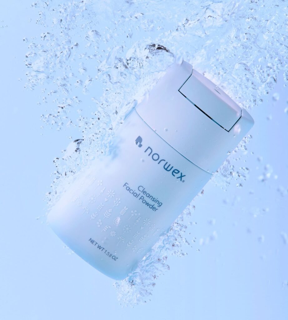
Norwex unveiled its first-ever rebrand. The complete rebranding began as a packaging refresh and resulted in a strategic overhaul of the brand’s aesthetic to refine and strengthen its messaging for greater clarity, consistency and scalability. The company worked with London-based creative agency The Workroom to develop an elevated brand story that includes a new logo designed to reflect Norwex’s Norwegian heritage while evolving into a more modern look with muted, nature-inspired colors and branding that is structured into three categories of Home Care, Family Care and Personal Care.
“The rebrand signals to our consultants, consumers and team that we are making a fundamental change in how we elevate and grow our business,” said Beate Hjeltnes, Norwex CEO.
The Workroom team described the new clean, minimalist brand identity as “the art of just enough,” and believe the result is clarified positioning that will strengthen trust across Norwex’s consultant network as it continues to maintain its core values while evolving and expanding its product portfolio.
Since the launch six months ago, The Workroom states that Norwex’s ROI has been swift. Within six months, the company’s social media impressions grew by 50% and website traffic shifted from 25-second durations to nearly four minutes.
The post Norwex Debuts New Brand Identity first appeared on Direct Selling News.